 |
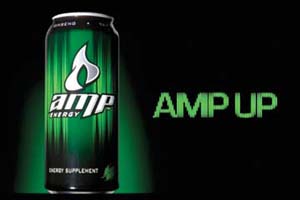
| Value: This energy drink (which is delicious) ad shows value with it's color. The shadows and darkness of the background is great contrast in comparison to the bright green and blured like design. |
 |
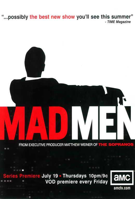
| This Mad Men advertisement shows great line. The contrast of the stark colors really stick out. Mad Men is an amusing show and illustrations drawn for it pop out even in simple 2D like the cover art. |
 |
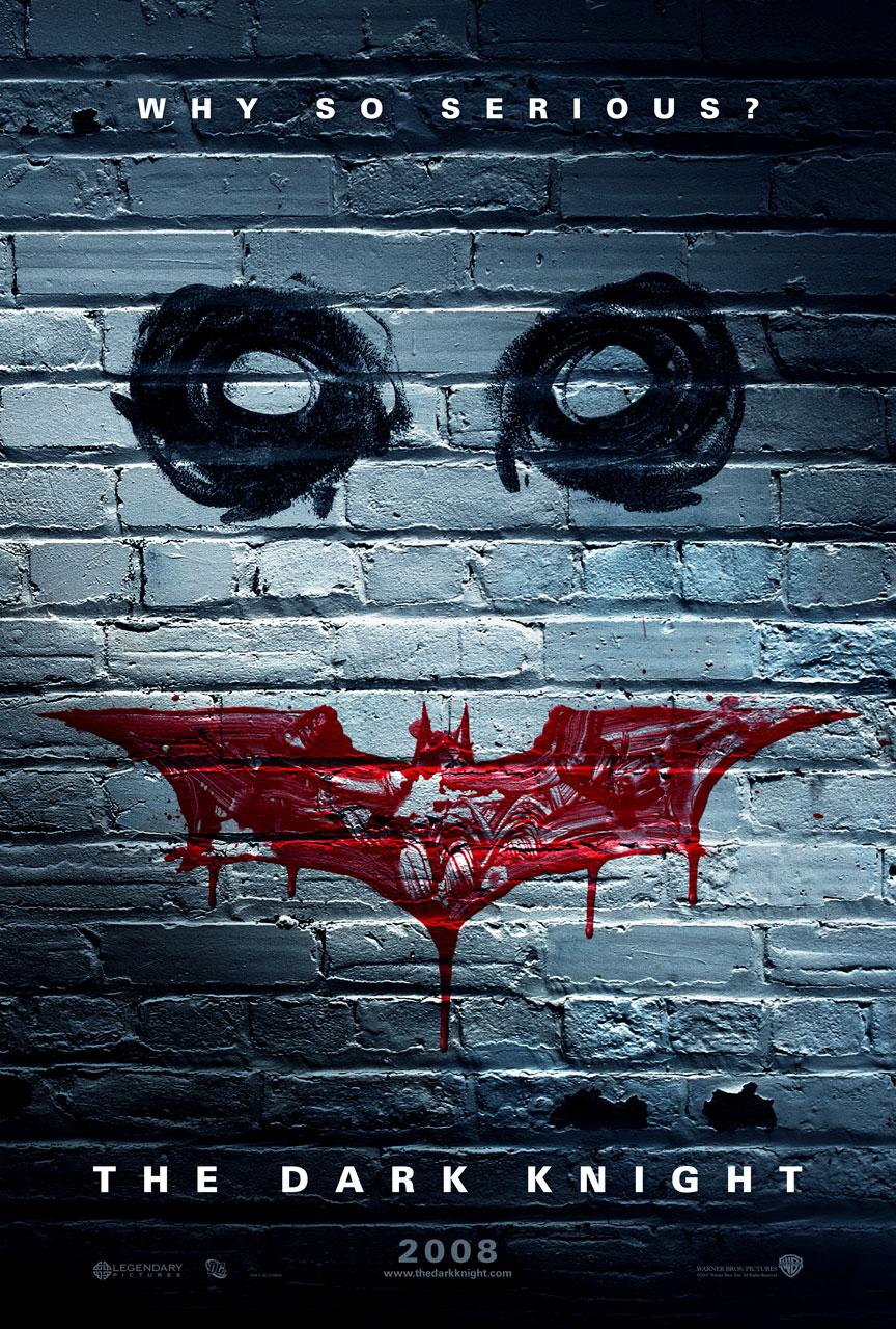
| Texture: This Dark Knight poster shows texture within the wall and spraypaint. Even with the text on it; it had rough and smooth texture.From the contrast of the paint of course. |


No comments:
Post a Comment